Modeling & Materials

Module 2 weekly activities

Module 2 of this course focuses on the relationship between digital and physical space and how technology can change the way we understand our surroundings.


Module 2


In design challenge 1 we focused on exploring different areas around campus and observing how people use and interact with these spaces. We looked at the layout, atmosphere and design of each location while connecting our observations to architectural psychology, environmental psychology and landscape theory. The goal was to better understand how physical environments influence people's experiences and identify opportunities for spatial design.

Design Challenge 1
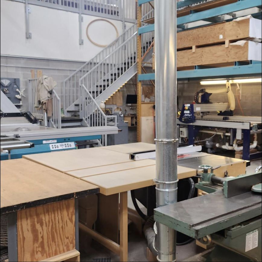
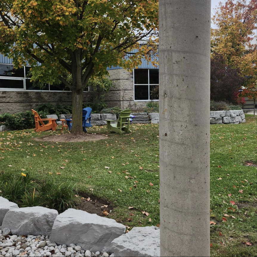
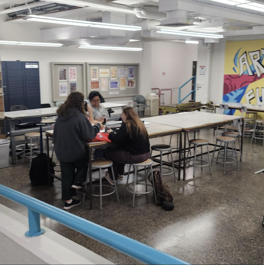
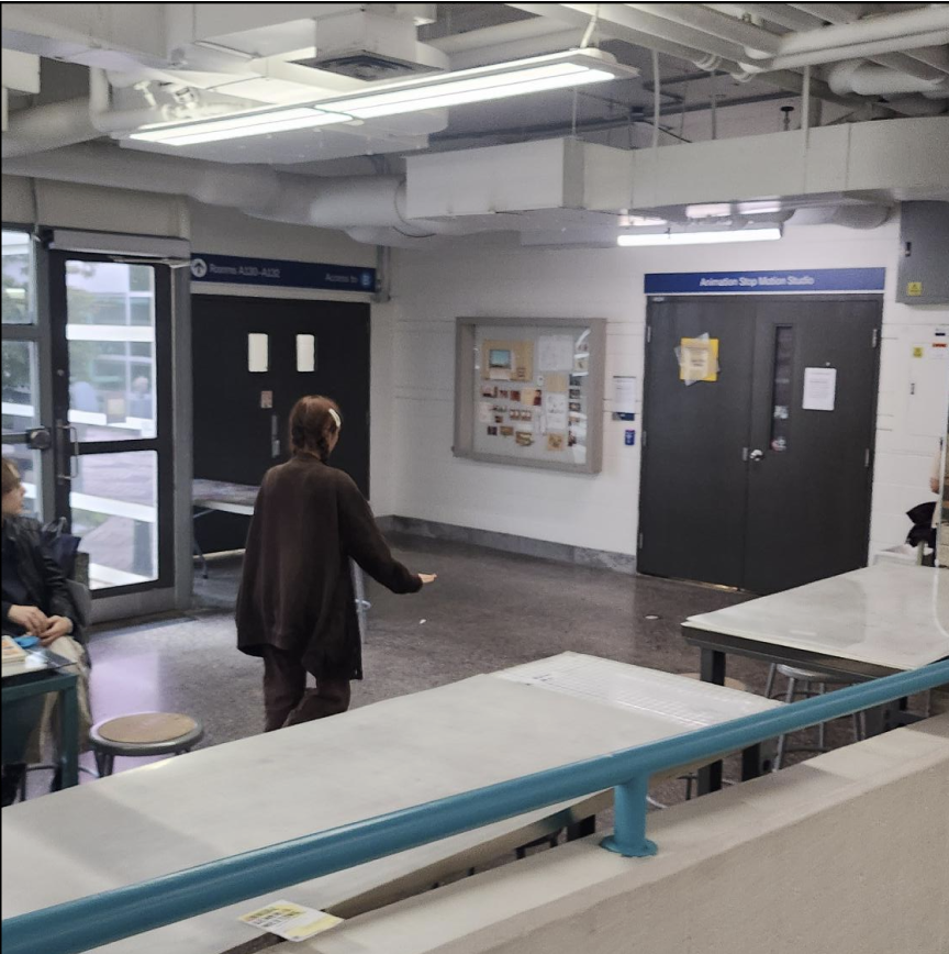
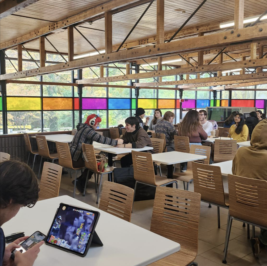
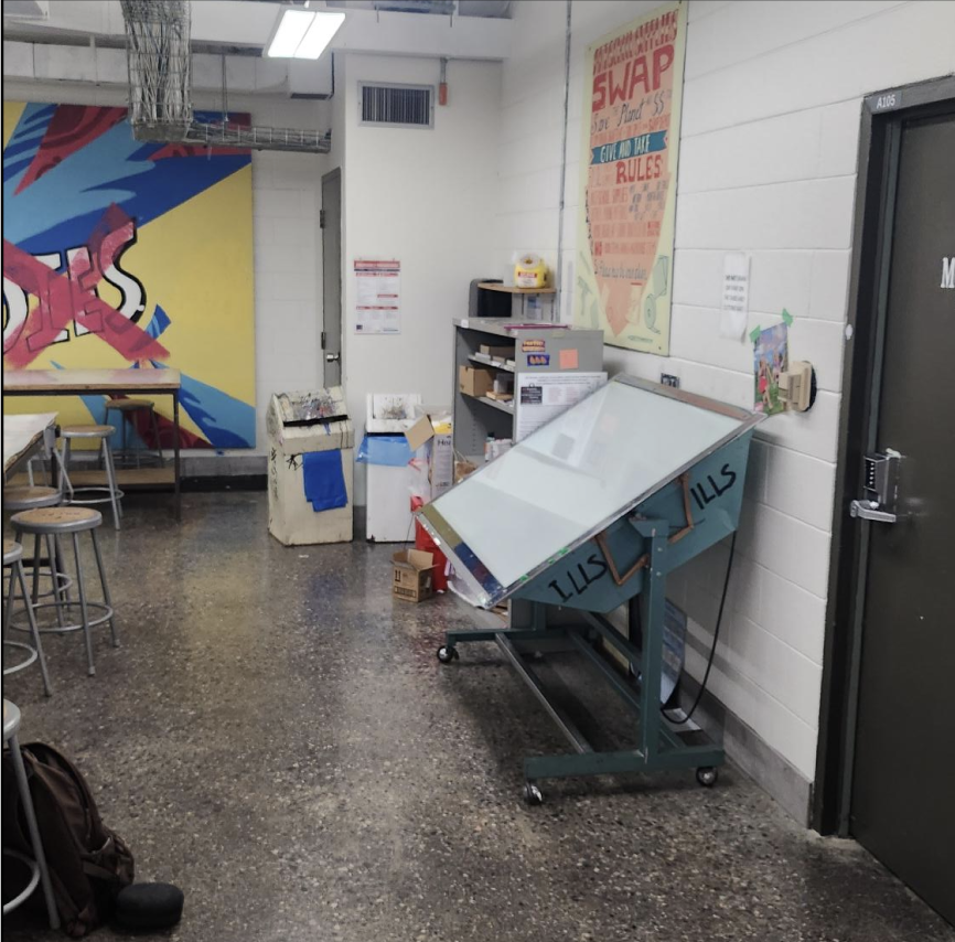
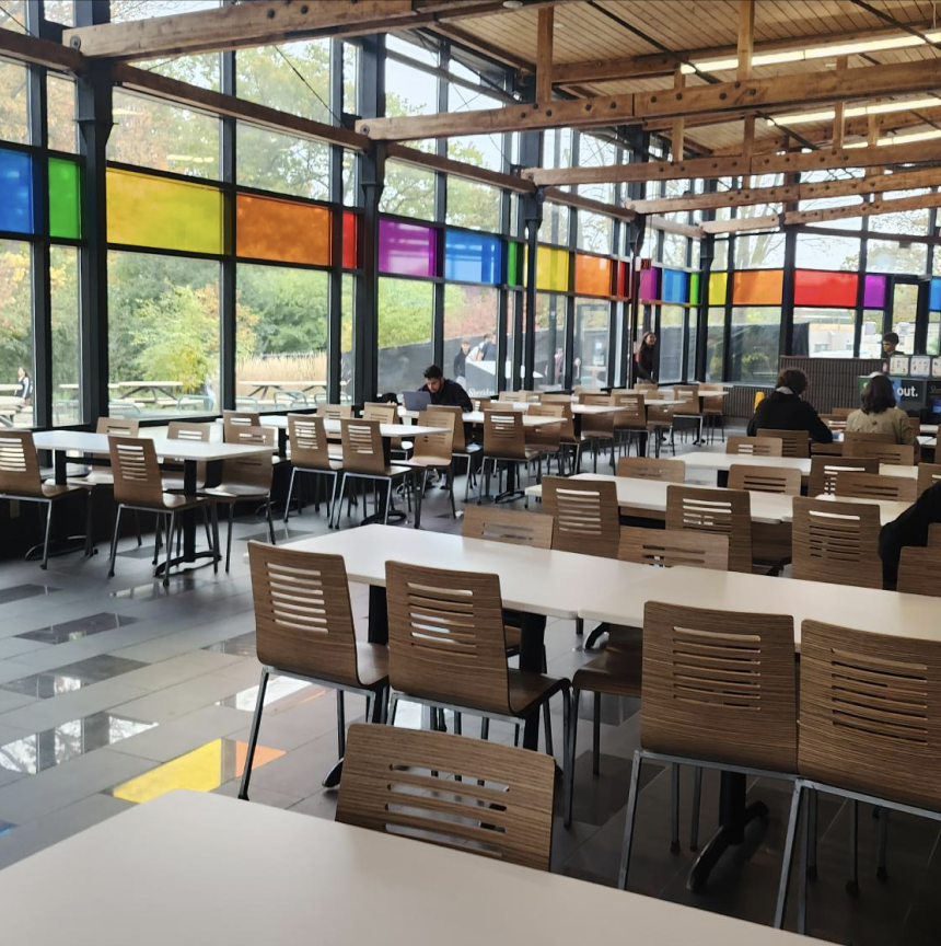
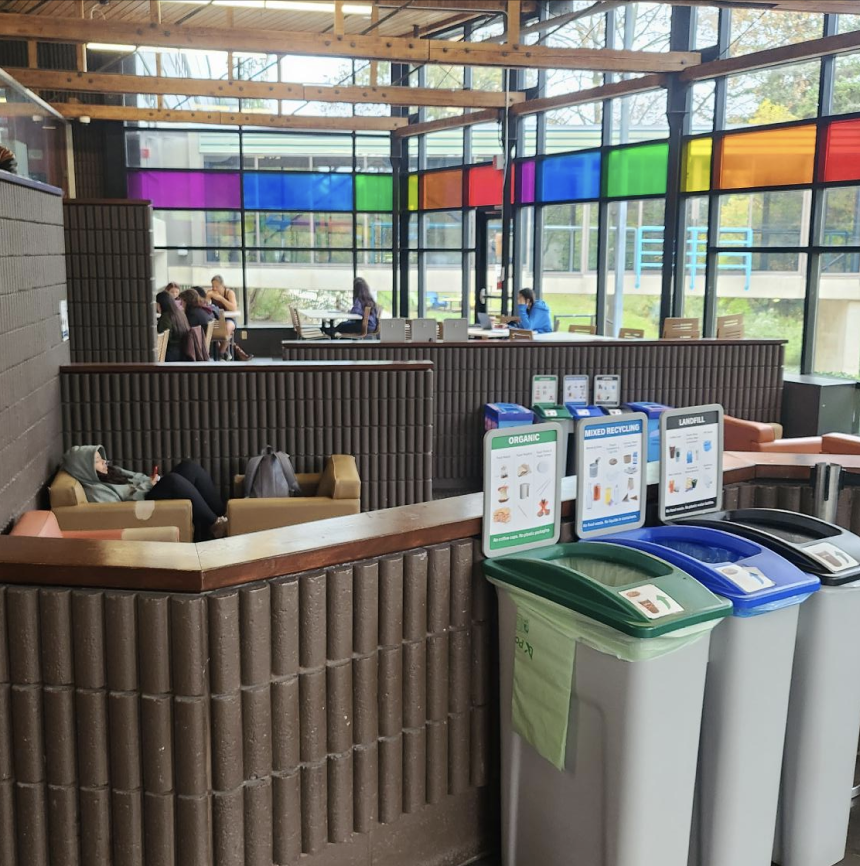
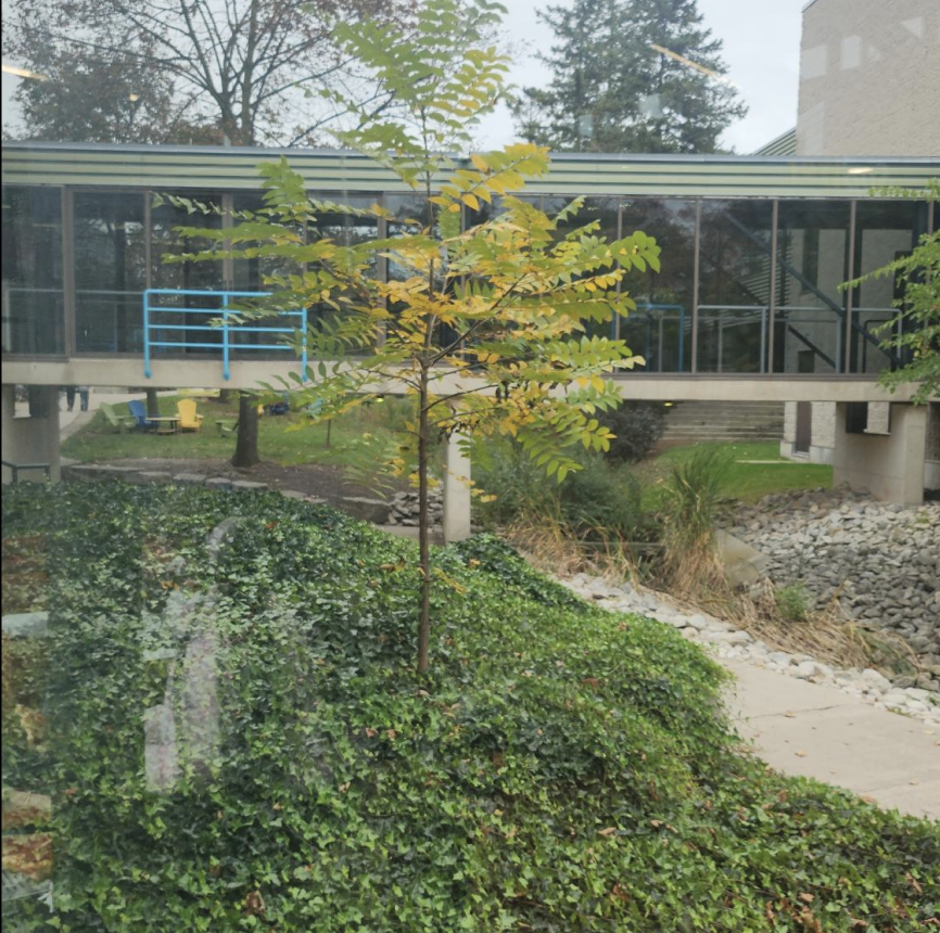
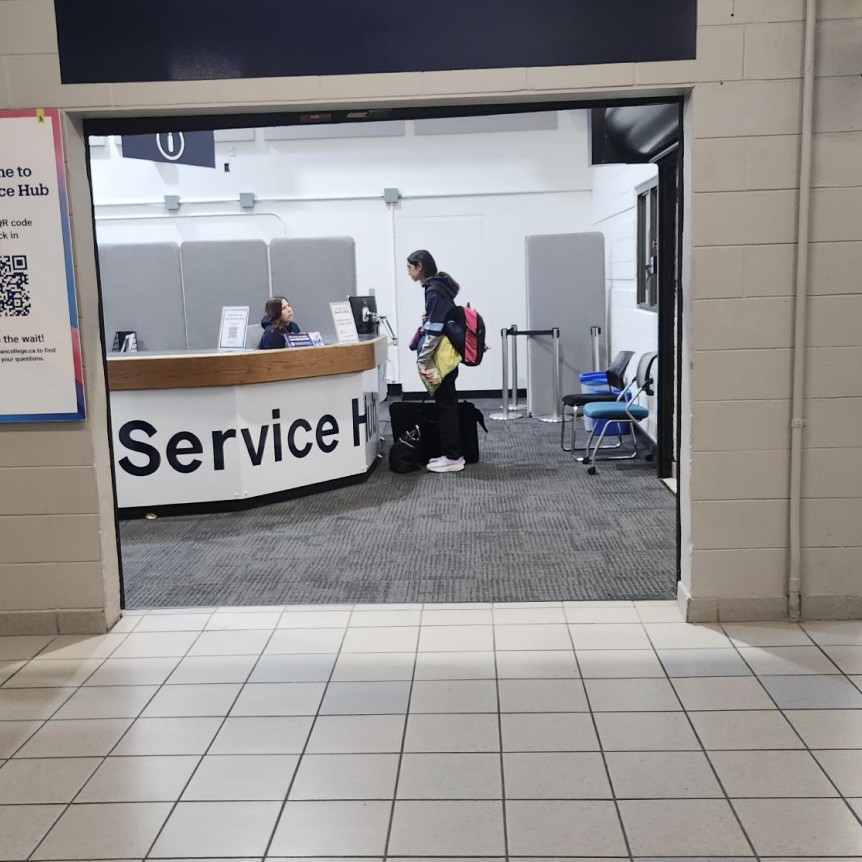
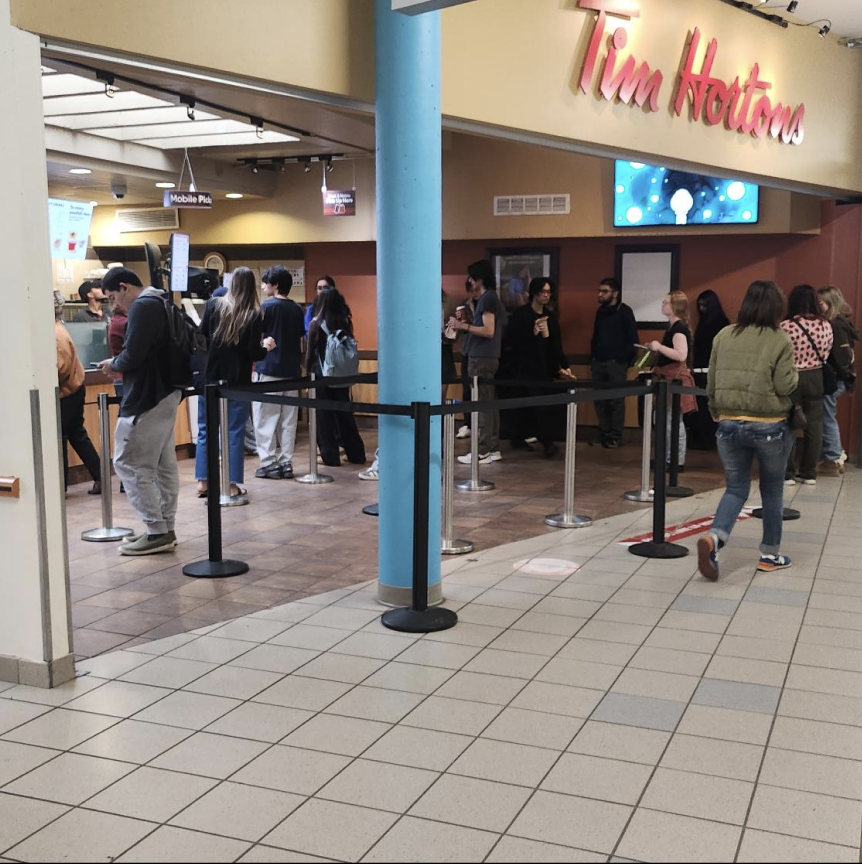
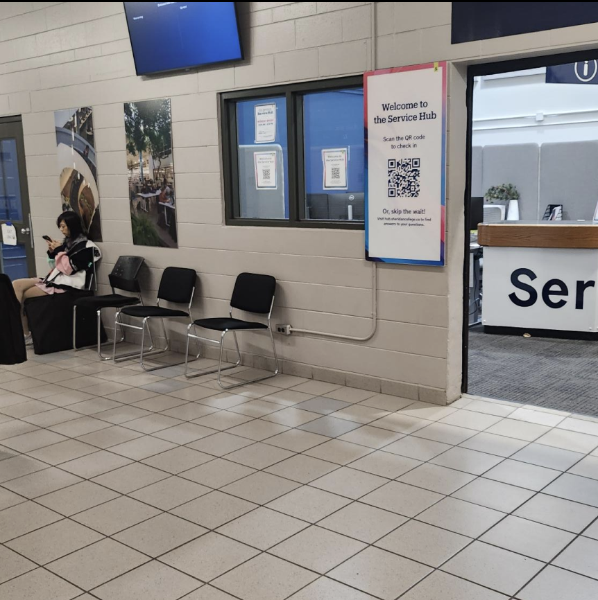
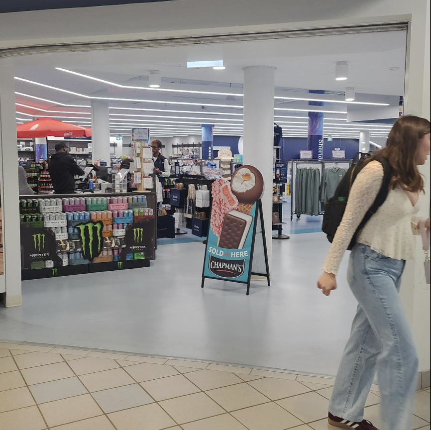
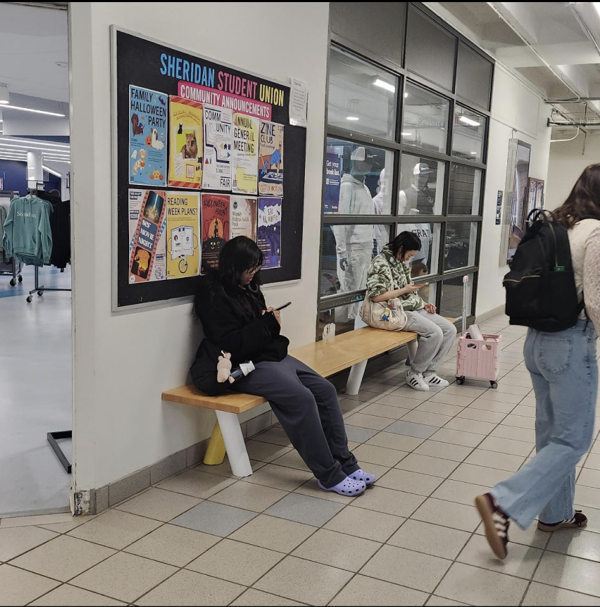
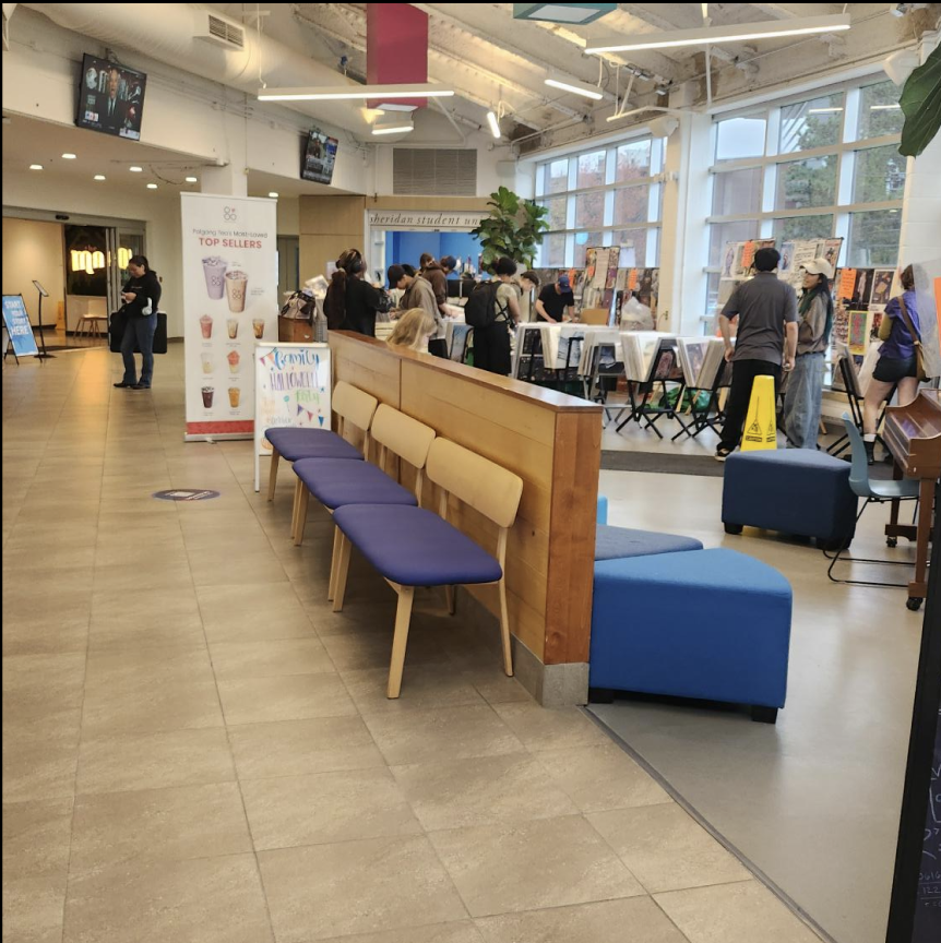
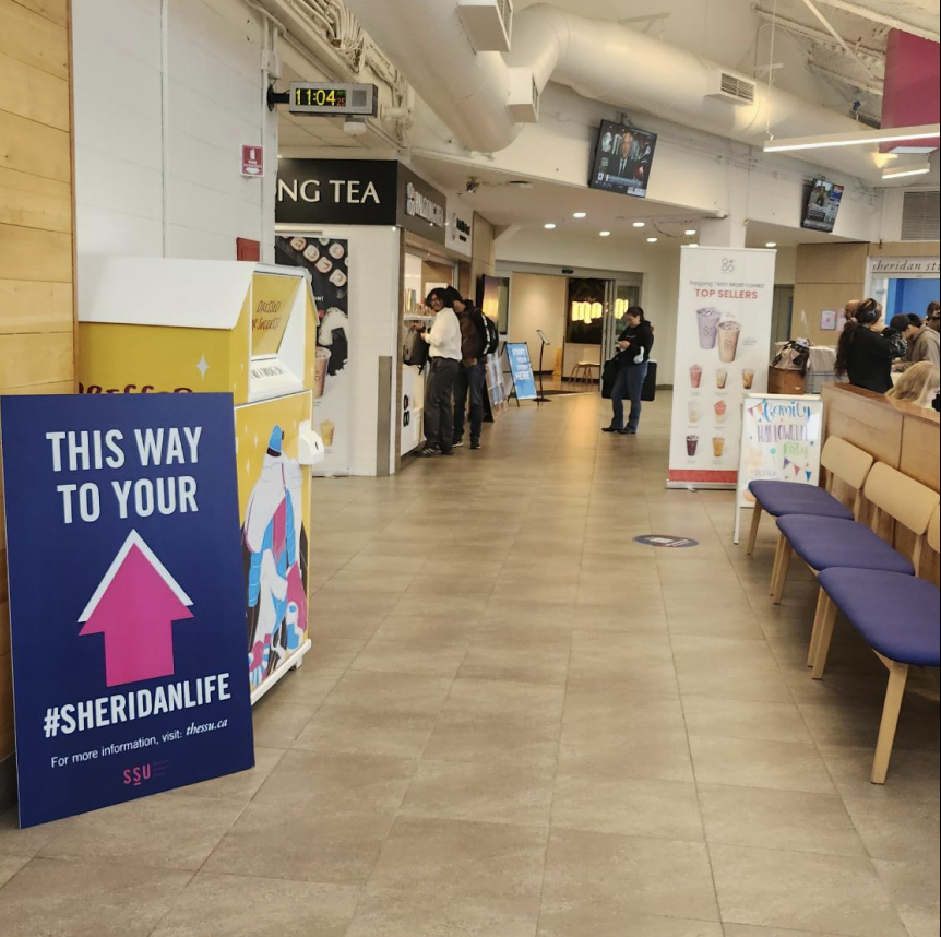
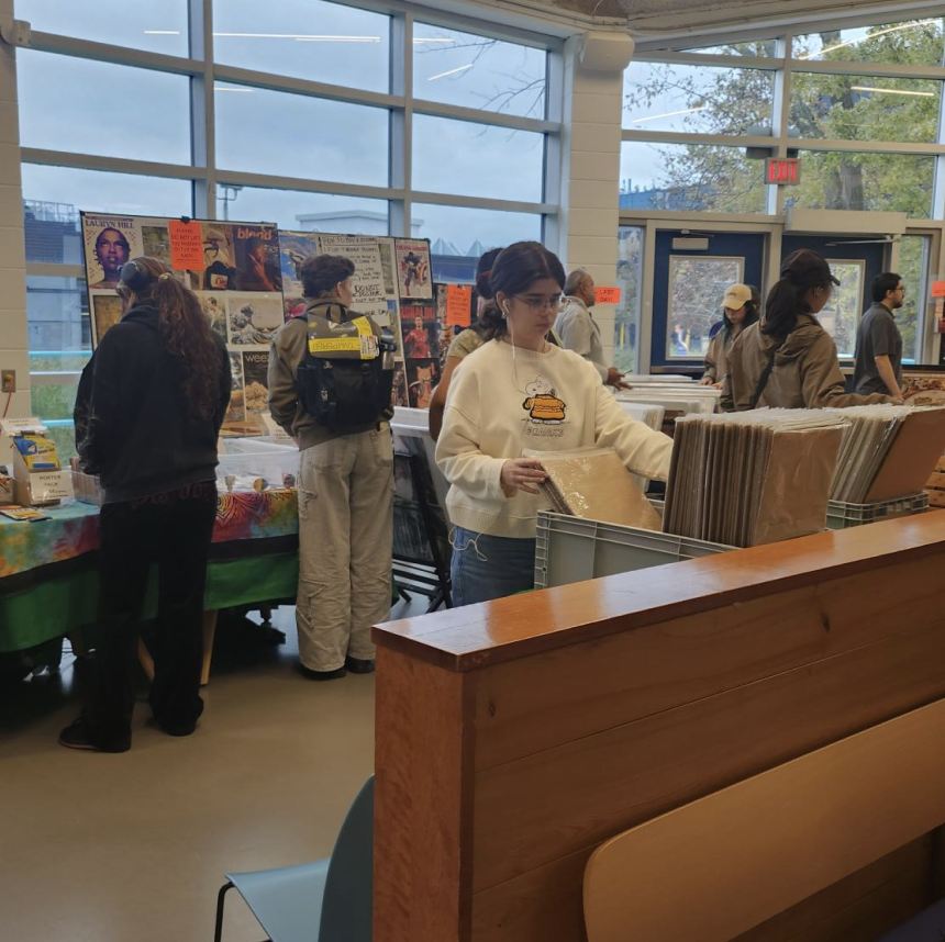
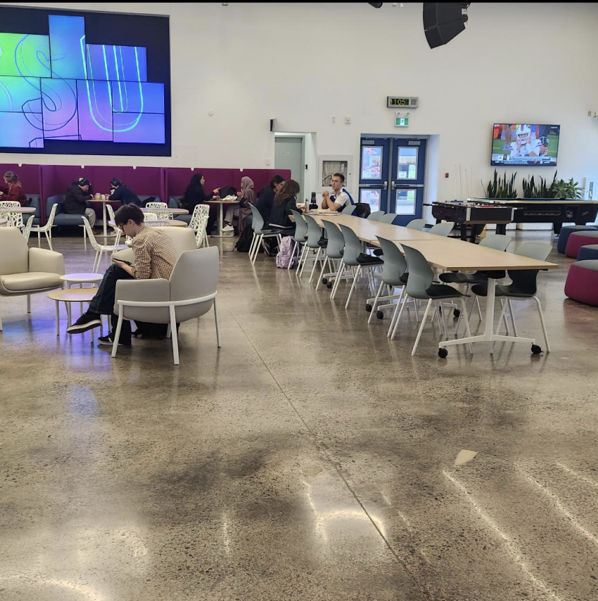
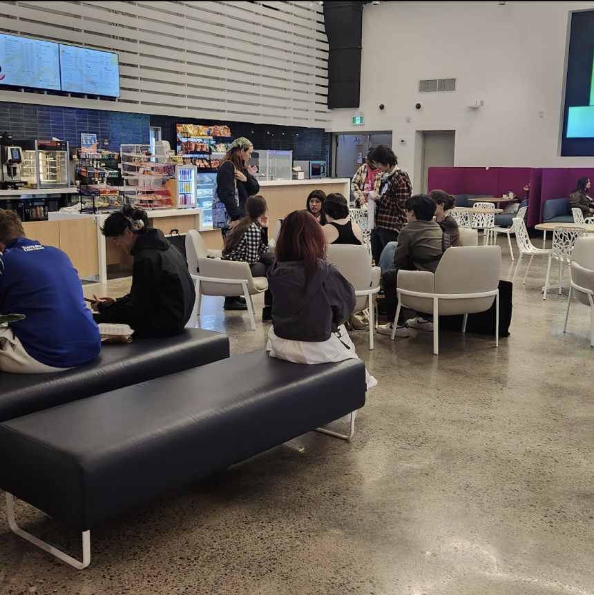
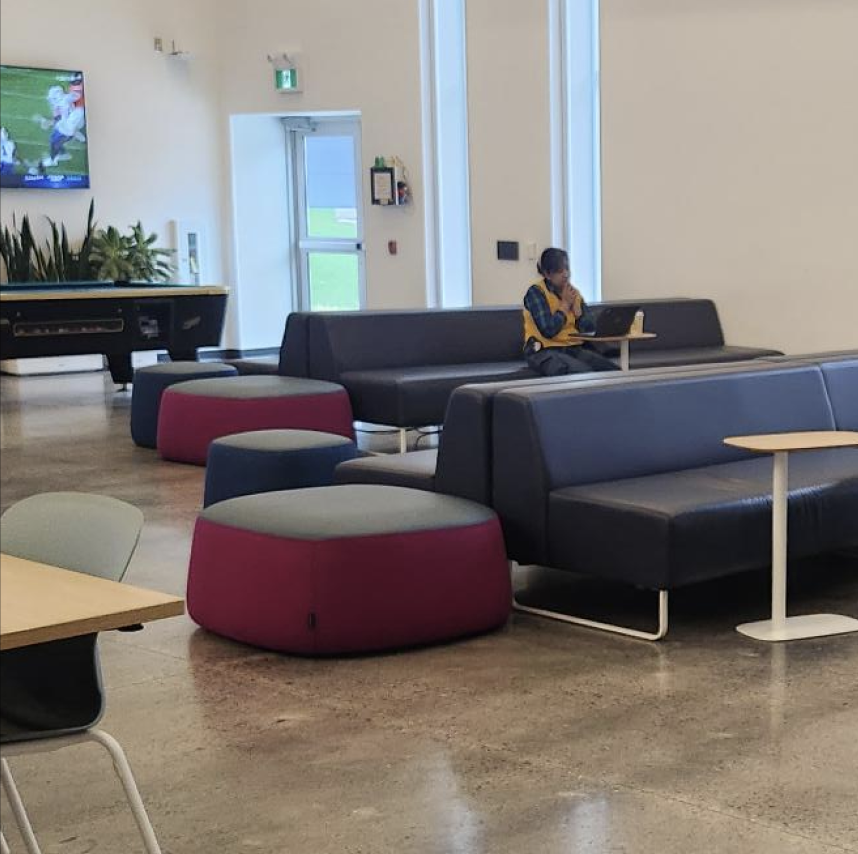
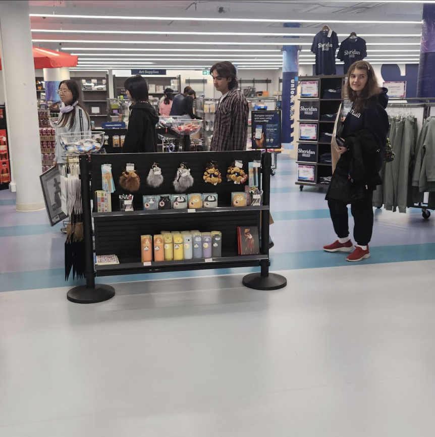
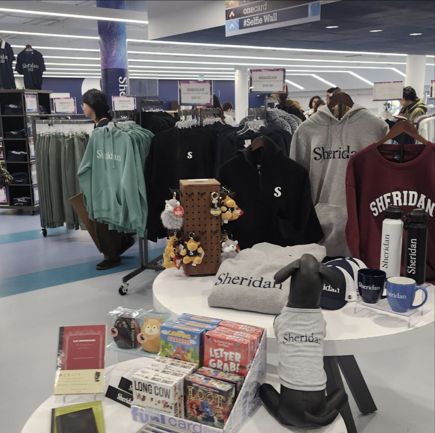
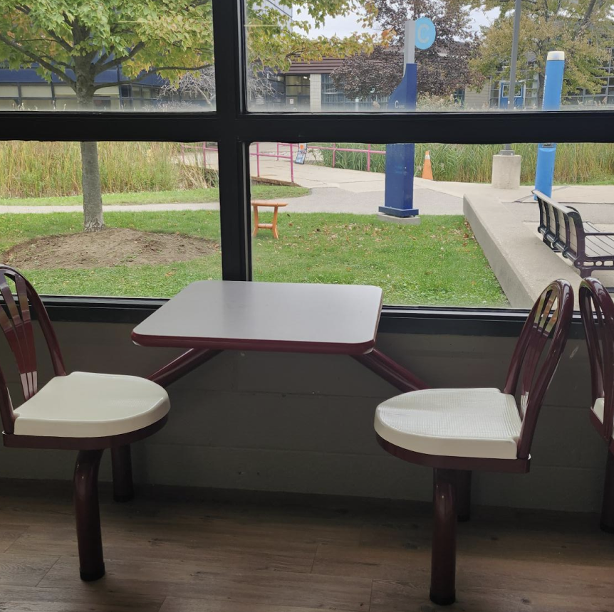
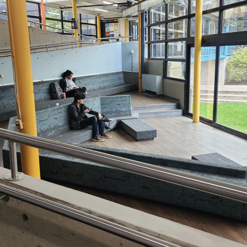
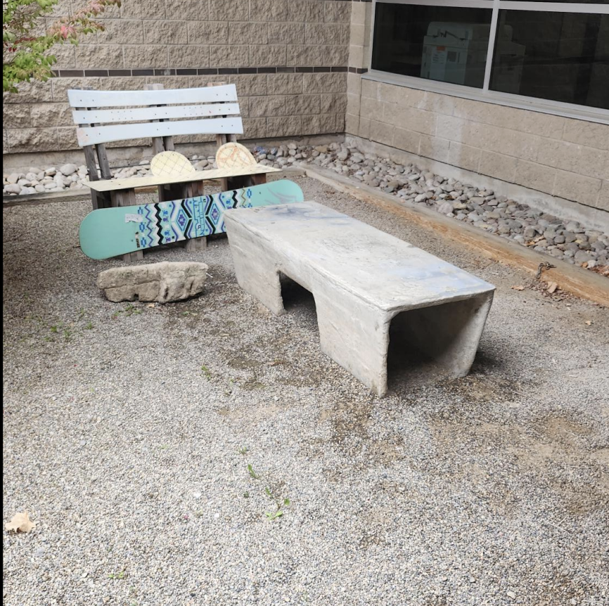
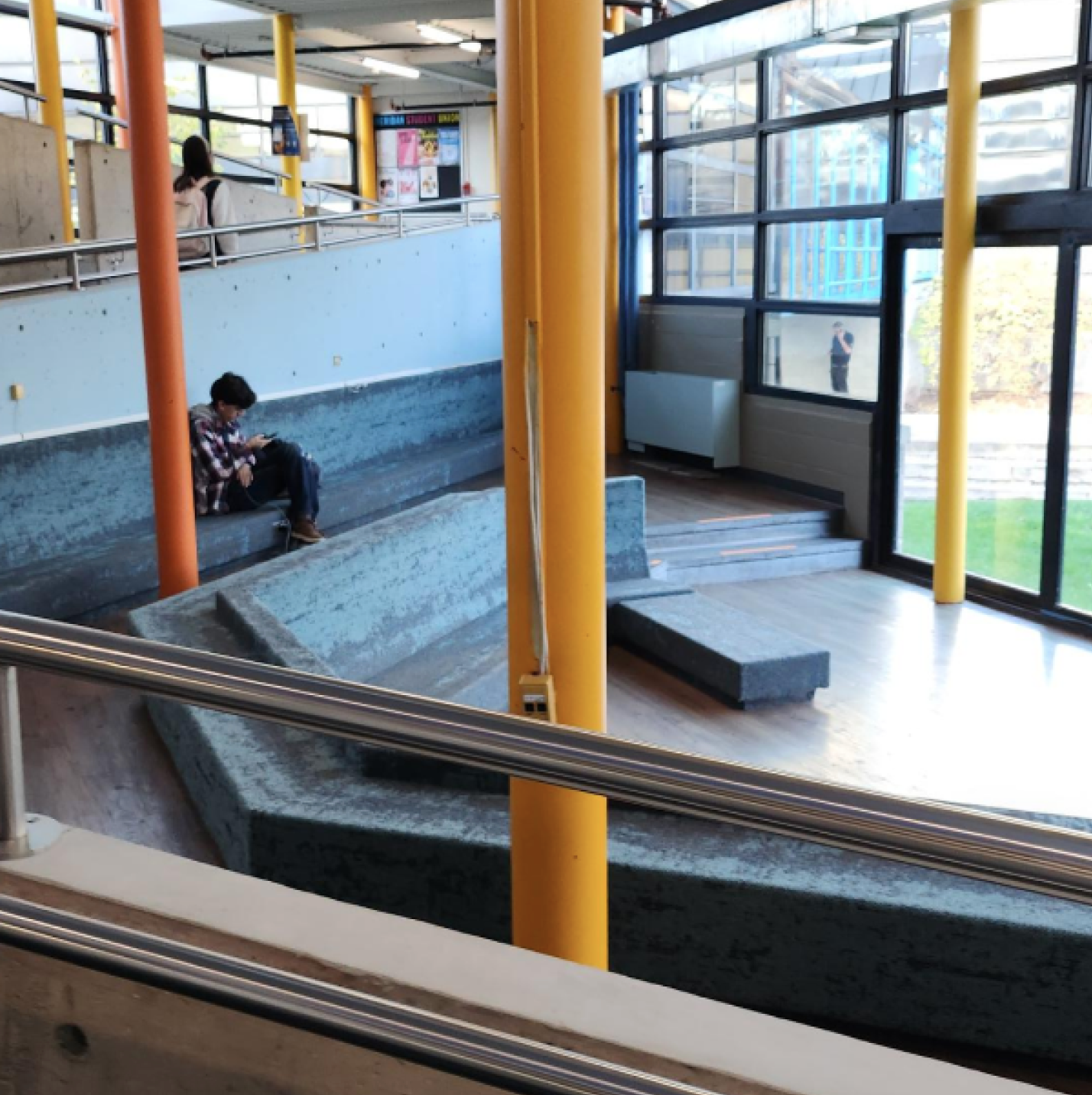
This space is a woodworking workshop where students can create, experiment and use different equipment to work on projects. The way the large worktables, machinery and tools are arranged makes the space feel practical and productive. The open layout also allows multiple people to work at the same time while sharing resources. The exposed structure and industrial elements help communicate the purpose of the space and give it a typical workshop atmosphere. From an environmental psychology perspective, having a dedicated space for creating and experimenting can encourage creativity, collaboration and hands on learning. I also noticed how the different levels and visible staircases help organize the space and connect its different areas. One potential spatial design opportunity could be adding interactive projections or directional elements to help students navigate the equipment and different working areas. This outdoor area provides a quieter space away from the busier indoor areas of campus. The combination of trees, grass, rocks and seating makes the environment feel more natural and relaxing. The greenery contrasts with the surrounding buildings, making the area feel a little more separate and like it is its own space. From an environmental psychology perspective, having access to outdoor spaces and greenery can help improve mood and provide a place for students to take a break between classes. The placement of the bench also gives students a place to sit and enjoy the surroundings. Landscape theory connects to this space through the way natural and built elements are combined to create a usable outdoor environment. One potential design opportunity could be adding subtle lighting or interactive sound elements that respond to movement and make the space more engaging. This area is a casual shared space for the illustration and animation students to work, have discussions and complete group projects. The large shared tables and stools make it easy for multiple people to gather and work without feeling too restricted. I also noticed the artwork and colourful details around the space, which help make it feel more creative and interesting. Compared to a traditional classroom, the environment feels more relaxed and informal. From an environmental psychology perspective, the open layout encourages students to interact and collaborate with one another. The arrangement also gives people the flexibility to use the space in different ways depending on what they are working on. One potential spatial design opportunity could be adding interactive tables or projection surfaces that allow students to share ideas and work together digitally. This could build on the existing purpose of the space while making it more interactive. This area is part of the same space as the previous photo, but it offers a more private and independent environment for students to work. The seating arrangement and separation between work areas allow students to focus on their own projects without being as involved in group activities. The space still feels open and connected to the rest of the environment while providing a little more separation. From an environmental psychology perspective, having different types of workspaces is important because students have different needs depending on what they are doing. Some may prefer working in groups, while others need a quieter area with fewer distractions. The layout gives students the flexibility to choose how they want to use the space. One potential spatial design opportunity could be adding subtle warm lighting to create a comforting environment. The cafeteria is located in the glass atrium, making it feel bright and open. The natural light and surrounding windows create a welcoming atmosphere where students can eat, relax or spend time with friends. However, majority of peiple used this space to eat because of how close it is to where food is sold. The open layout makes the space feel connected to the rest of campus. From an environmental psychology perspective, lighting and views of the outdoors can affect how comfortable people feel in a space. Adding more varied seating or greenery could make the area even more inviting. This light box, used for illustration or animation work, gives students a surface to work on and view their projects. It gives another space for students to work in the shared illustration/animation workspace. This seating area within the cafeteria gives students a more places to sit, relax or work while still being connected to the open atrium. The natural light and open layout make the space feel welcoming. I noticed that people can use it for different activities depending on their needs. I also noticed that students used this space as a hangout spot, instead of soley a place to eat compared to the previous cafeteria space. This connects to architectural psychology because the layout can influence whether people feel comfortable staying in a space. This smaller seating area is part of the same cafeteria space as the previous photo, but it has a more relaxed feel because of the lounging chairs. It offers students a comfortable place to take a break or sit casually without needing a larger table or workspace. I noticed how changing the type of seating can completely change how people use an area. From an environmental psychology perspective, comfortable furniture can make people feel more relaxed and encourage them to spend more time in a space. This outdoor area provides another space for students to take a break from the busy indoor campus environment. The greenery and open space, as well as, it being a walking path instead of a place to sit makes it feel different compared to the other spaces i found. Having access to nature can change the atmosphere of a place and make it more inviting. This connects to landscape theory, which looks at how natural environments influence people's experiences. This reception area at the service hub gives students a clear place to go when they need help or information. The counter and seating make it feel organized and accessible. I noticed that the layout helps guide people toward the service area, although it could feel busy when several students are waiting. This area is the busiest spot on campus. Students can quickly grab food, meet friends or take a break between classes. Its central location makes it convenient, but it can also create lines and crowding. The placement of the counter affects movement through the space. Adding more room for waiting or clearer queue directions could make the area easier to move through. This area gives students somewhere to wait for their turn at the service hub. The seating makes it more comfortable, but the space still feels connected to the busy hallway around it. I noticed how even a small waiting area can affect the flow of people moving through campus. The campus store entrance is easy to notice and gives students access to merchandise and school supplies. The displays help attract attention, while the open entrance makes it easy to walk in. I noticed how the arrangement of products can influence where people look and move. This hallway combines seating with student information, giving people a place to stop while moving between classes. It feels like a useful transition space, although people passing through can make it feel busy. I noticed how the placement of seating affects the movement around it. Adding clearer separation between the walking path and seating could make the space more comfortable and accessible for students to check the announcements board. This lounge provides a place for students to relax, socialize or work between classes. The seating arrangement makes it feel more casual than a classroom or study area. I noticed how the different seating options allow people to use the space in their own way. Adding more comfortable seating could make it feel even more inviting. This hallway connects different areas of campus and helps students move between spaces. Signs and visual landmarks are important because they make it easier to understand what is going on around the area/on campus This area is a shared gathering space where students can meet, socialize and take part in campus events. It can be used in different ways depending on what is happening, making it a flexible part of the campus. I noticed how the open layout allows people to gather and interact more easily. This connects to spatial design because the arrangement of a space can influence how people come together. The campuses marquee is a large shared space where students can study, meet friends or take a break. Its open layout makes it feel connected to the rest of campus, while the seating gives people different ways to use it. I noticed how the space encourages social interaction. This area gives students a place to sit, socialize or wait while their food is being prepared. It serves as both a casual gathering space and a waiting area, making it useful for different purposes. I noticed how its location near the food service area makes it convenient for students, especially during busy times. This area feels even more casual, giving students a place to sit and talk to friends. The seating makes it suitable for socializing or spending time alone. In this particular area there are games students can play with friends. The merchandise display in the bookstore uses products and visual organization to attract students attention. It makes the store feel more engaging and encourages people to look around. I noticed how the arrangement of items can influence movement and what people choose to focus on. A design opportunity could be adding digital displays that provide more information about products or campus merchandise. This area displays campus merchandise and gives students a chance to connect with the school through the products. The layout makes the items easy to browse, although displays can sometimes feel crowded. I noticed how visual presentation affects the way people interact with the store. More open displays could make it easier to explore. The seating near the windows creates a connection between the indoor campus space and the outdoors. Natural light and the outside view make the area feel more open and comfortable. This smaller seating area gives students a quieter place to sit while still being part of the larger campus environment. Its position near the windows makes it feel more open and connected to the outdoors. I noticed how smaller spaces can offer a different experience from busy common areas. Adding comfortable seating. This outdoor seating area gives students a place to sit and take a break between classes. The simple concrete design fits into the surrounding landscape, but it may not feel as comfortable for longer periods. The materials and layout affect how people use the space.

Design Challenge 2
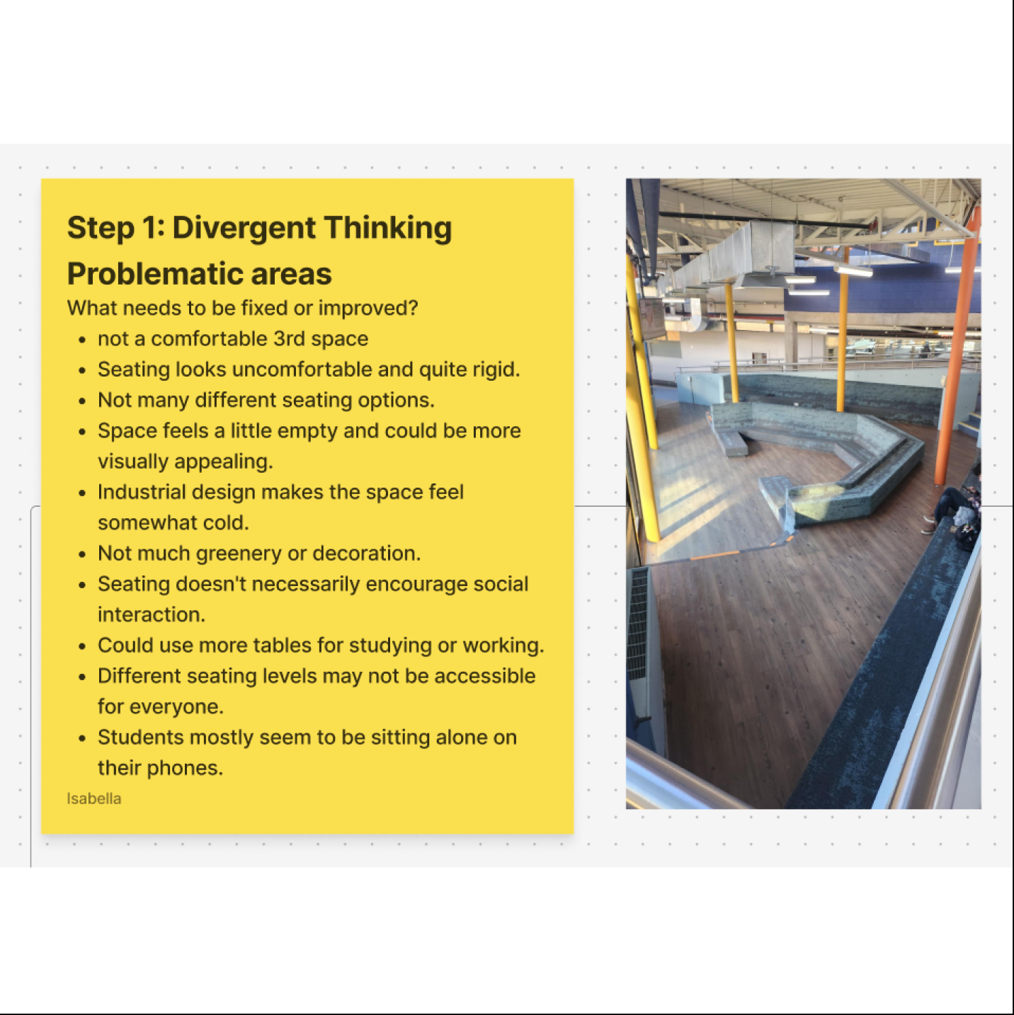
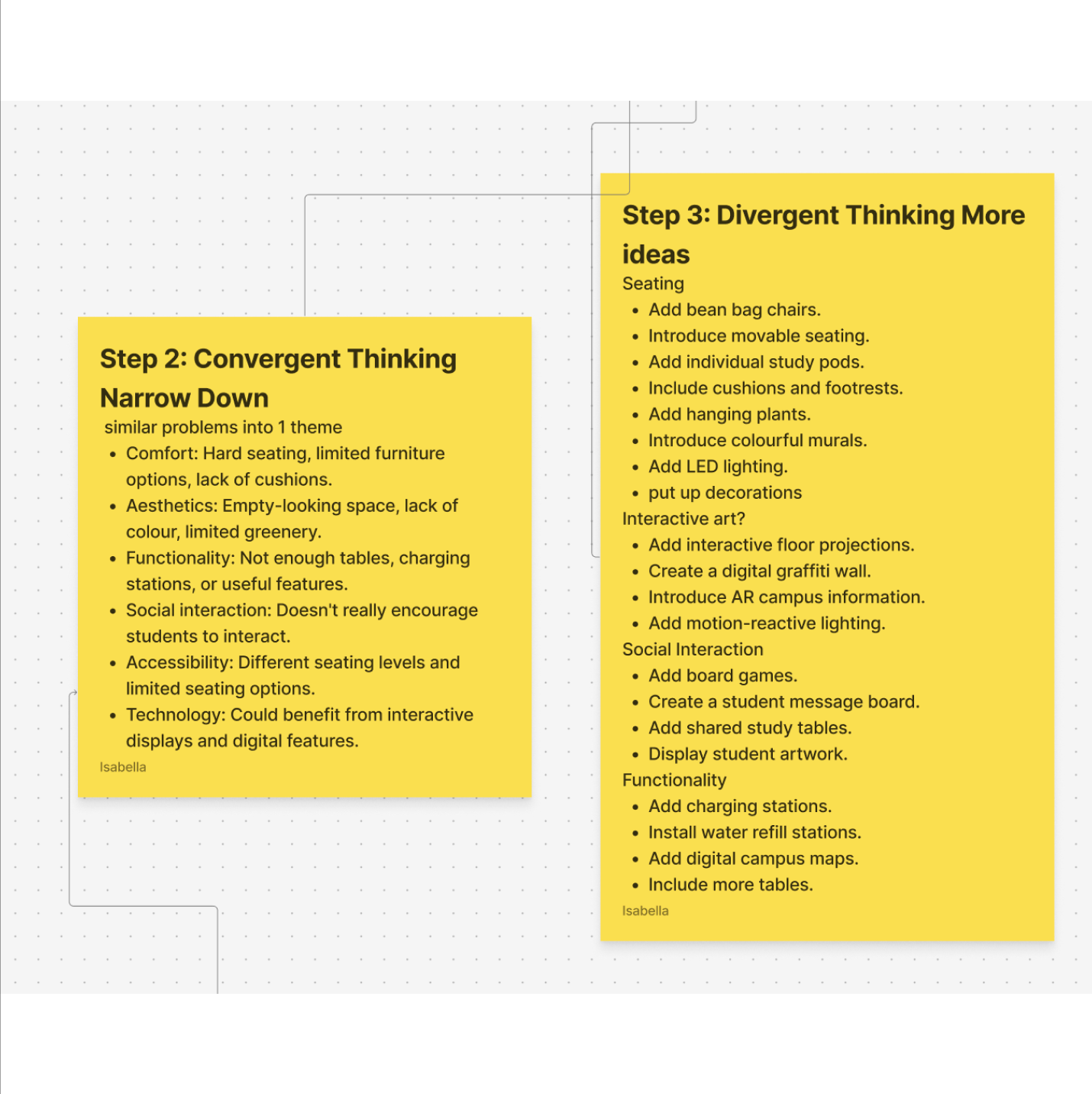
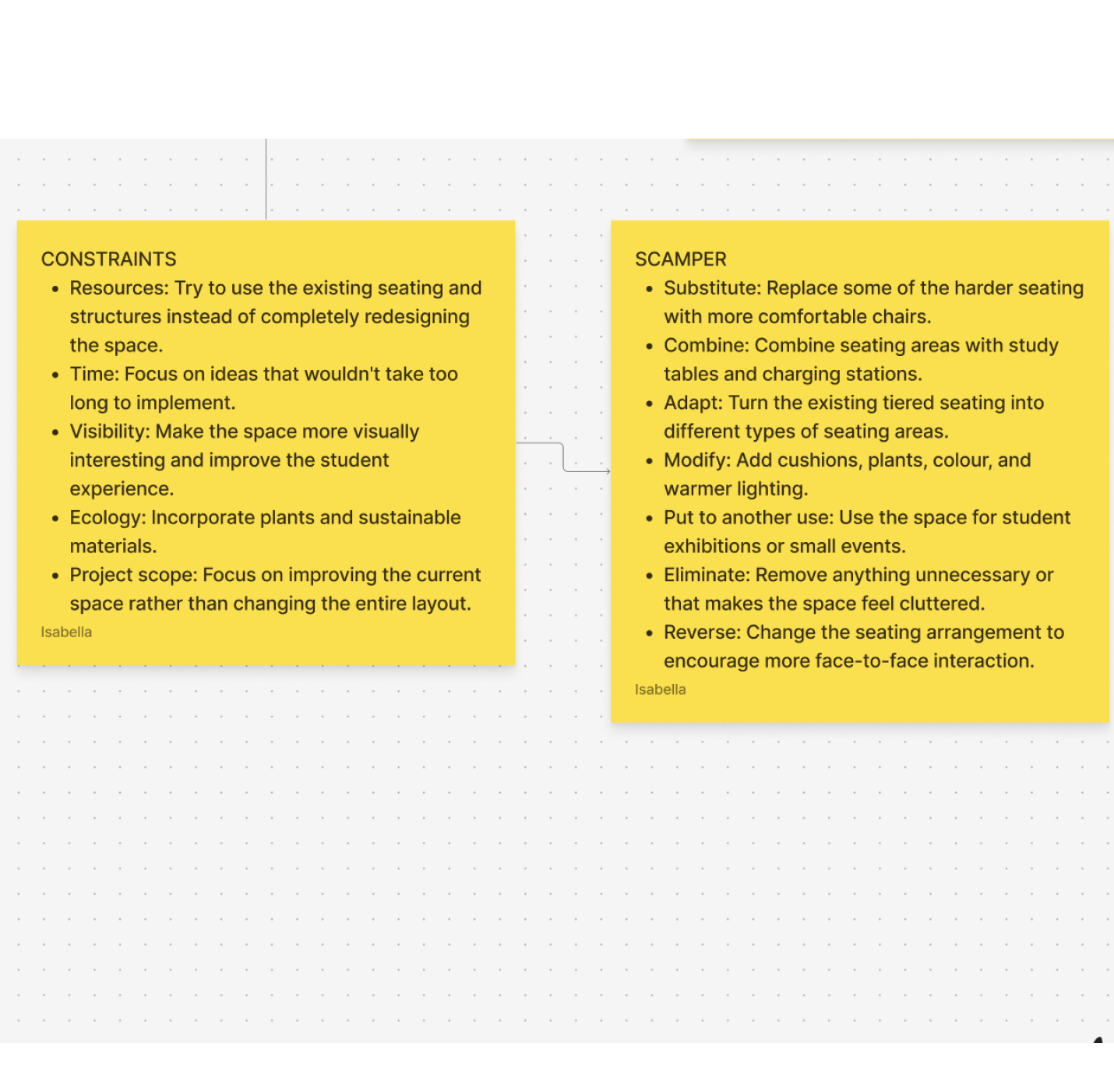
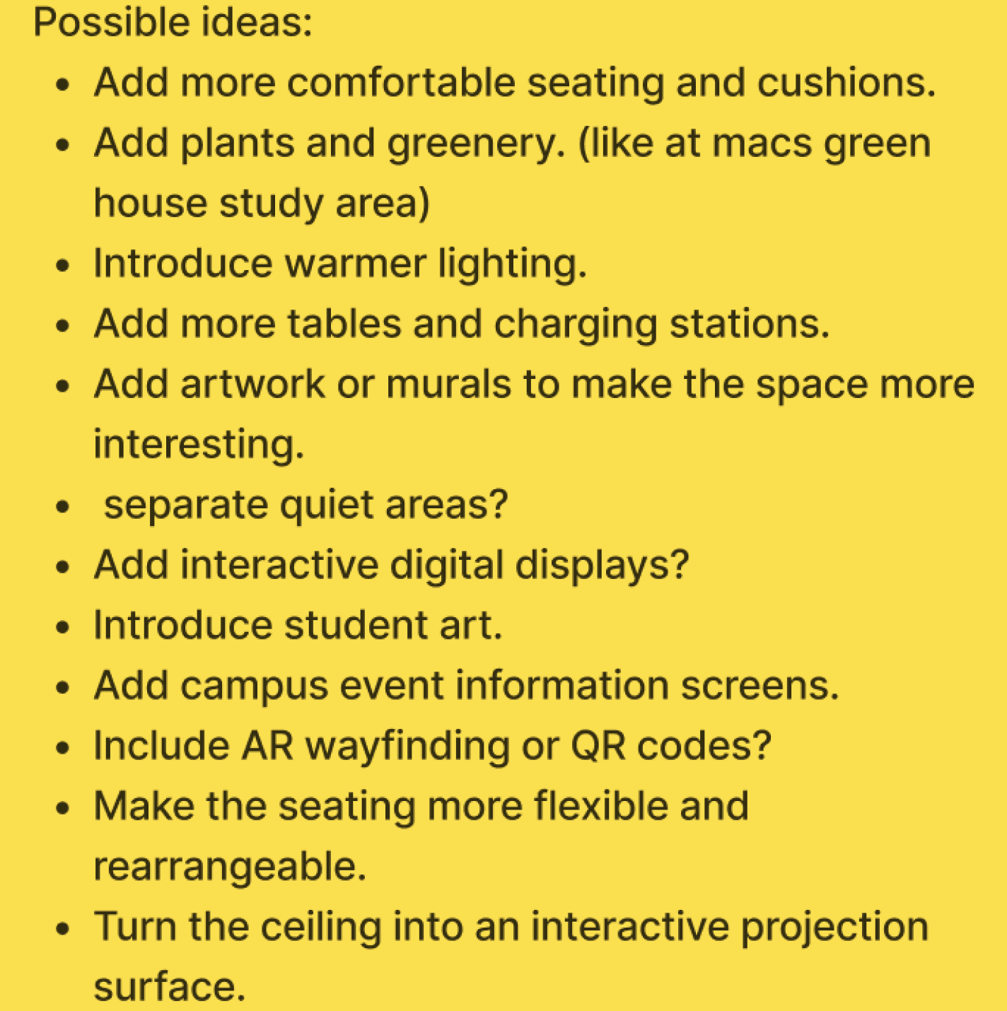
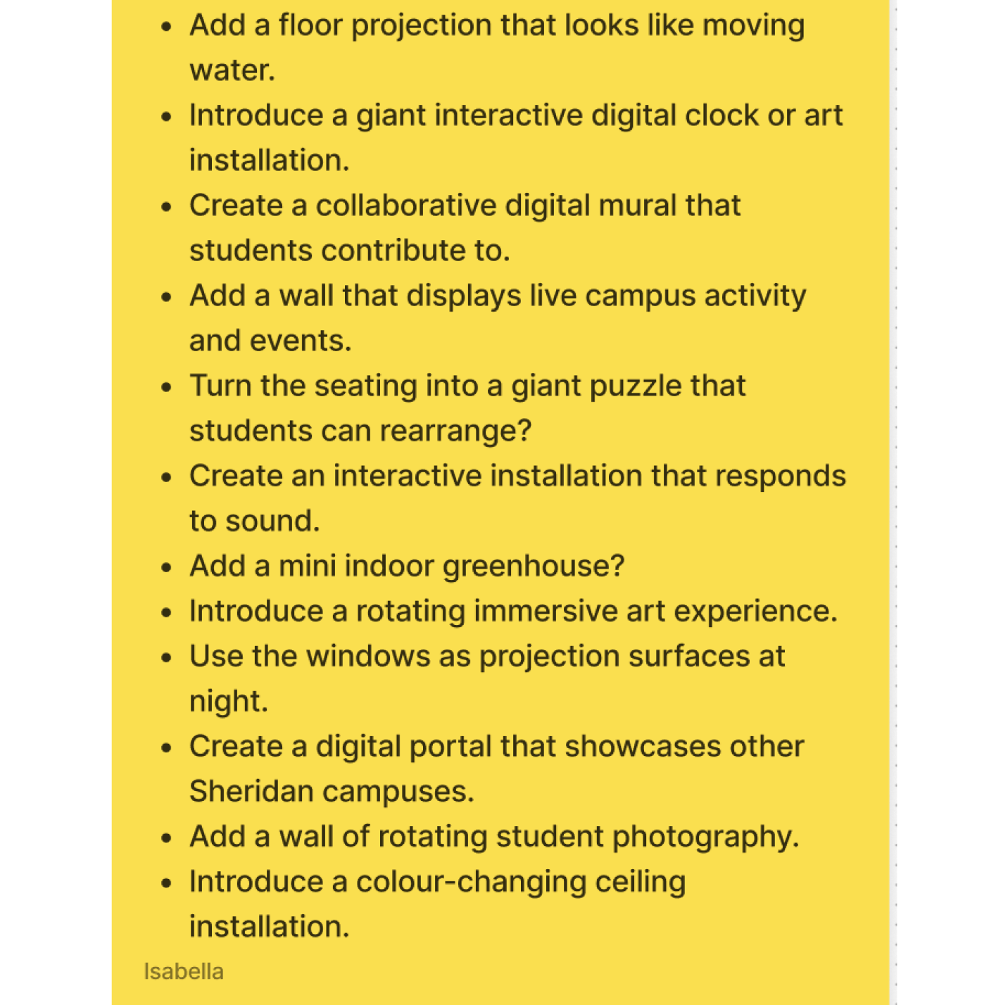
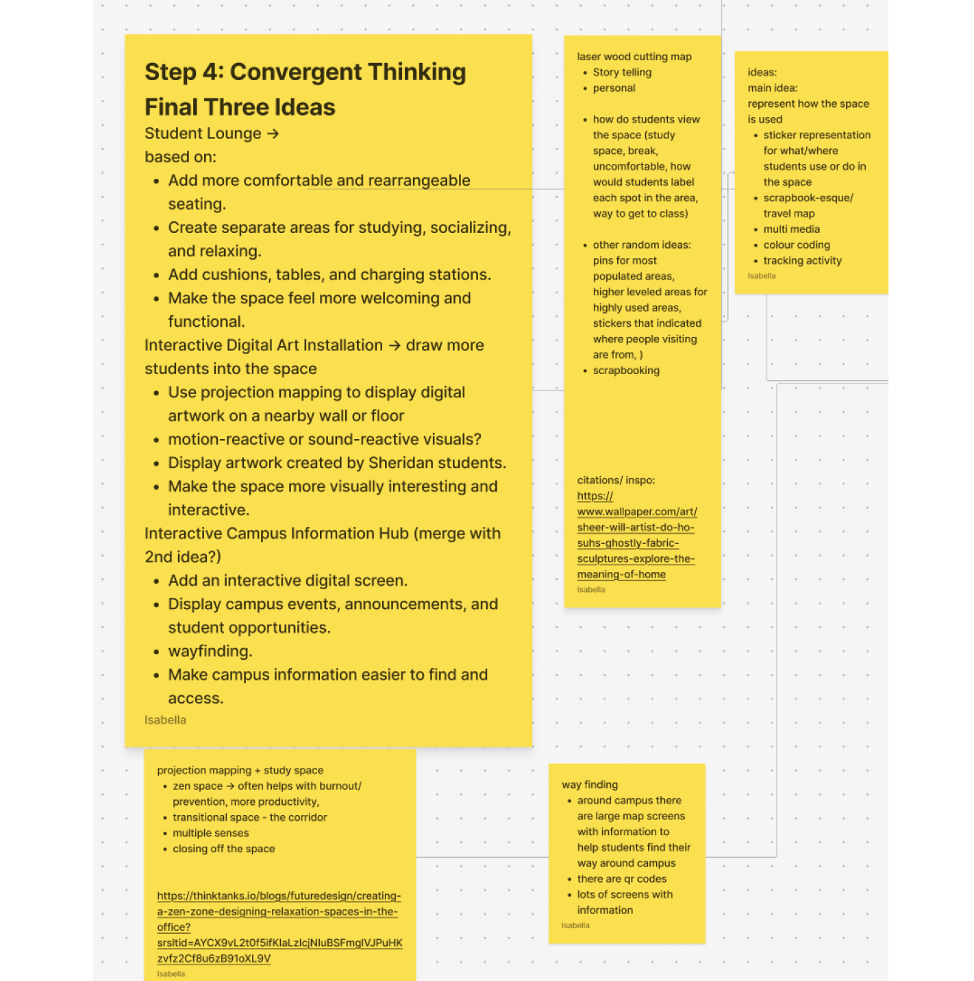
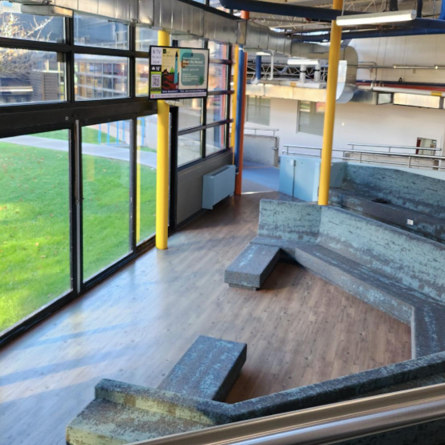
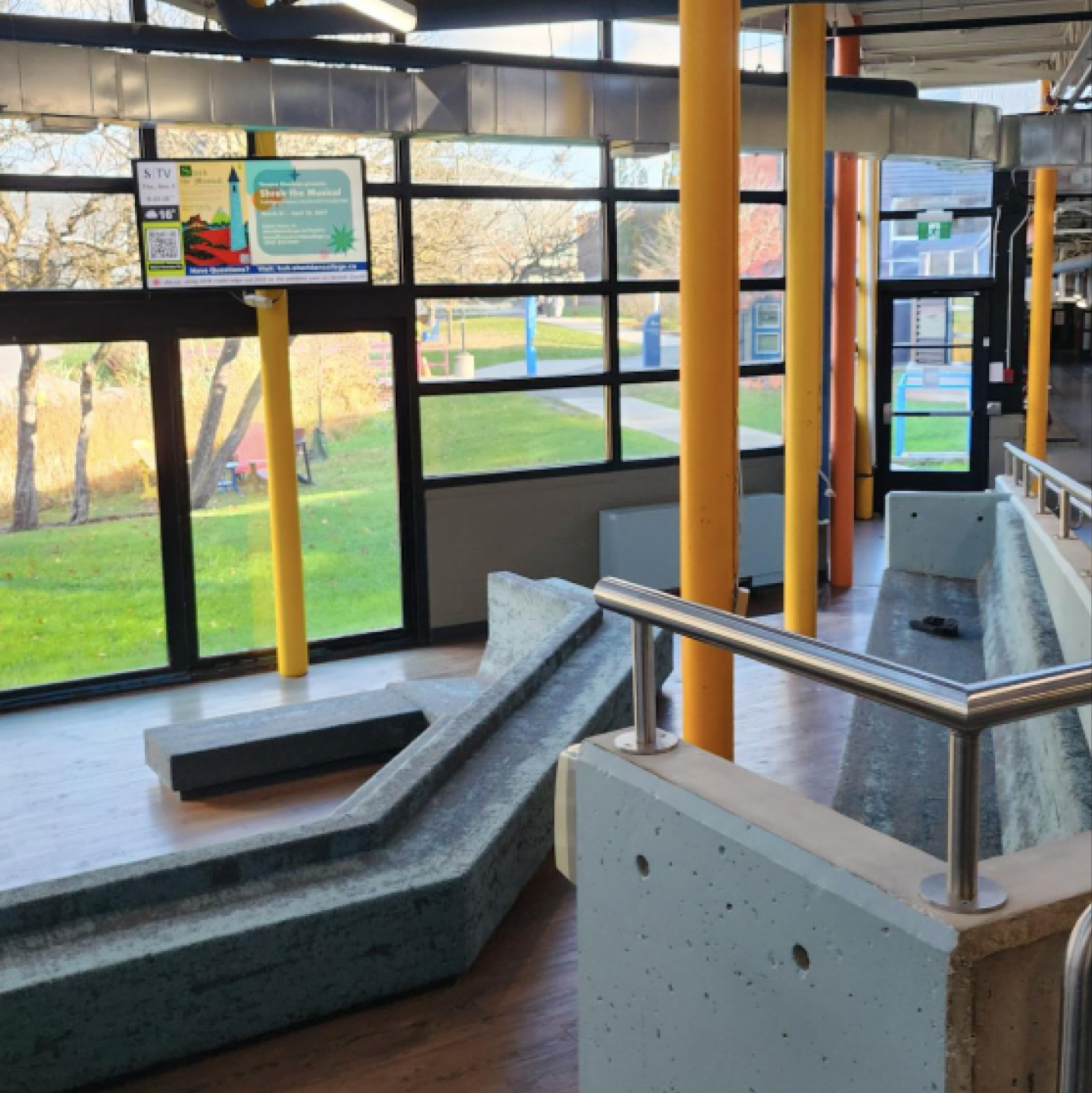
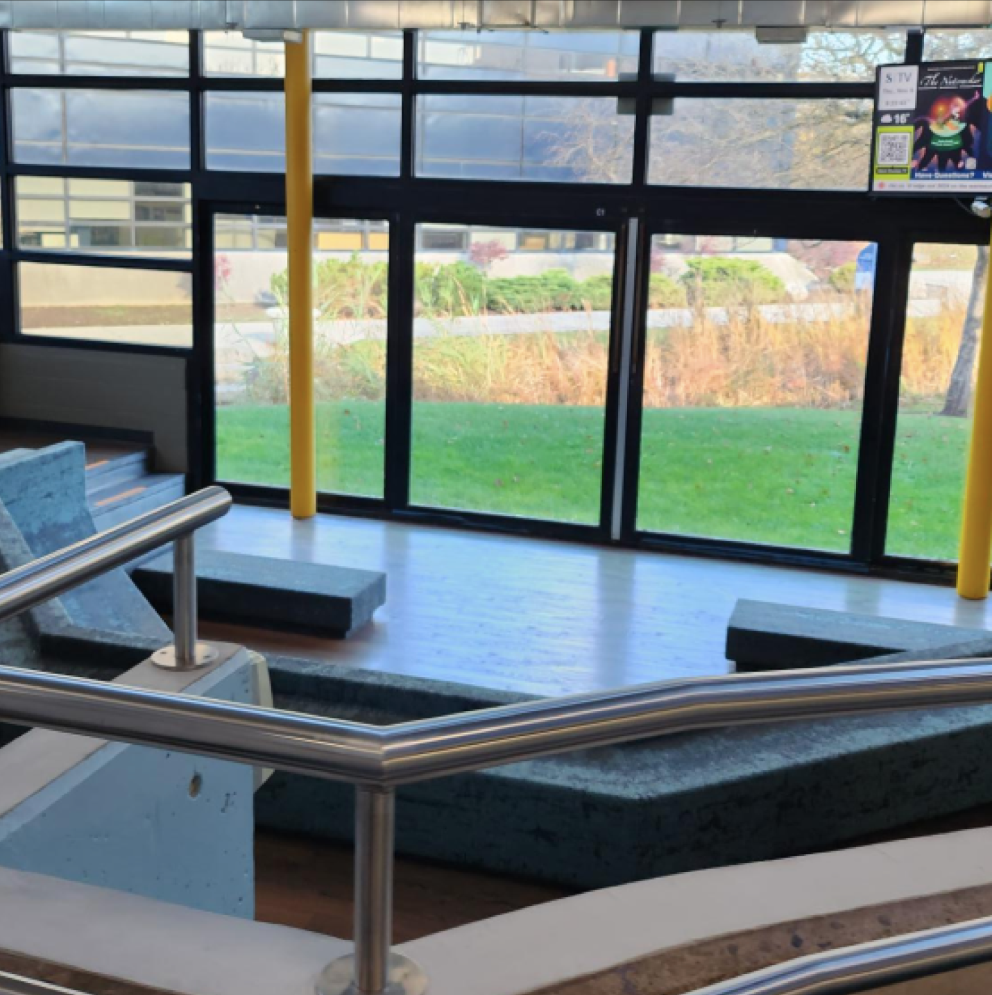
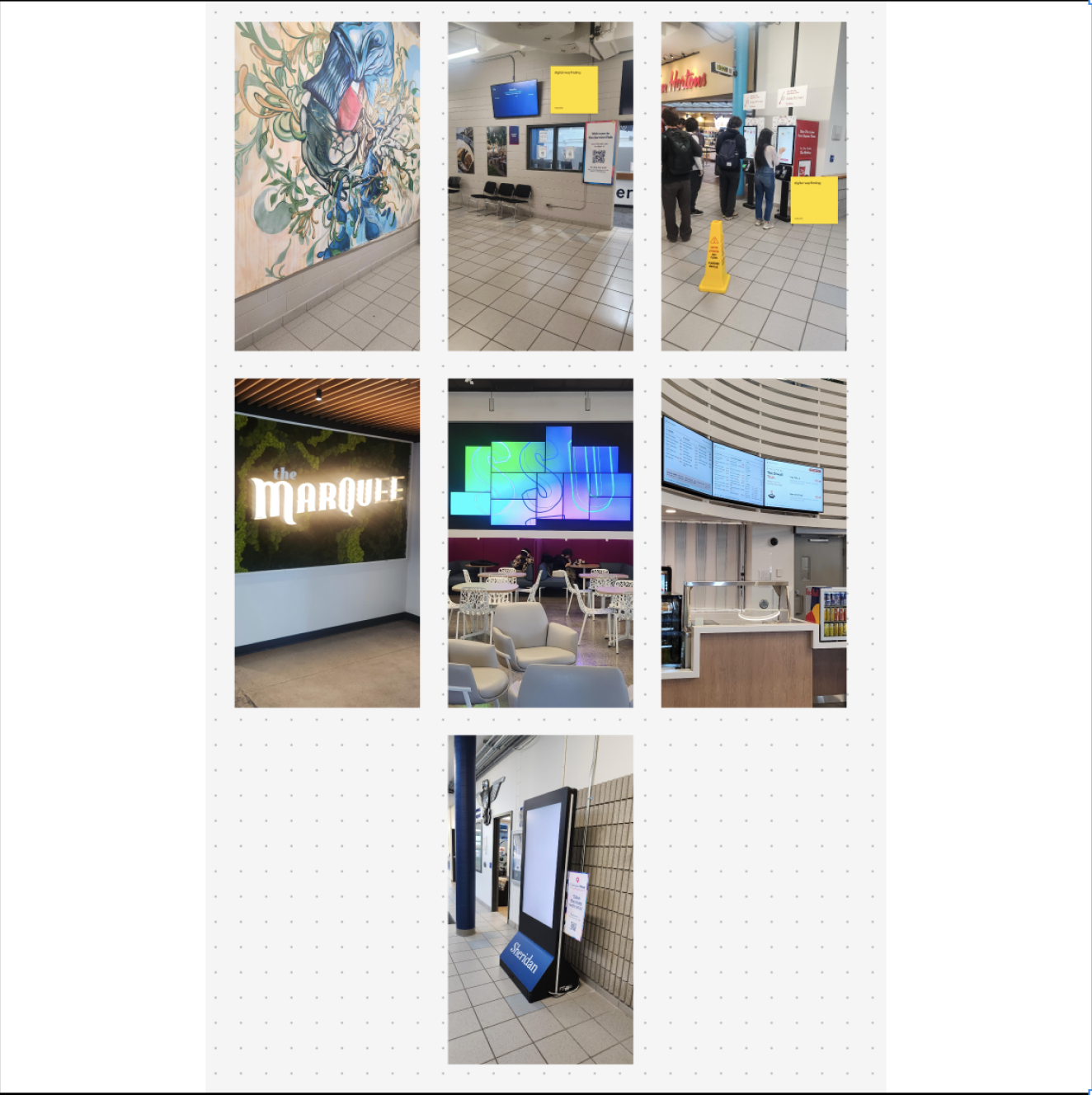
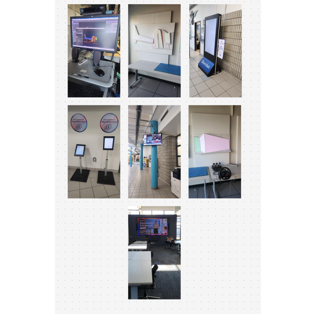
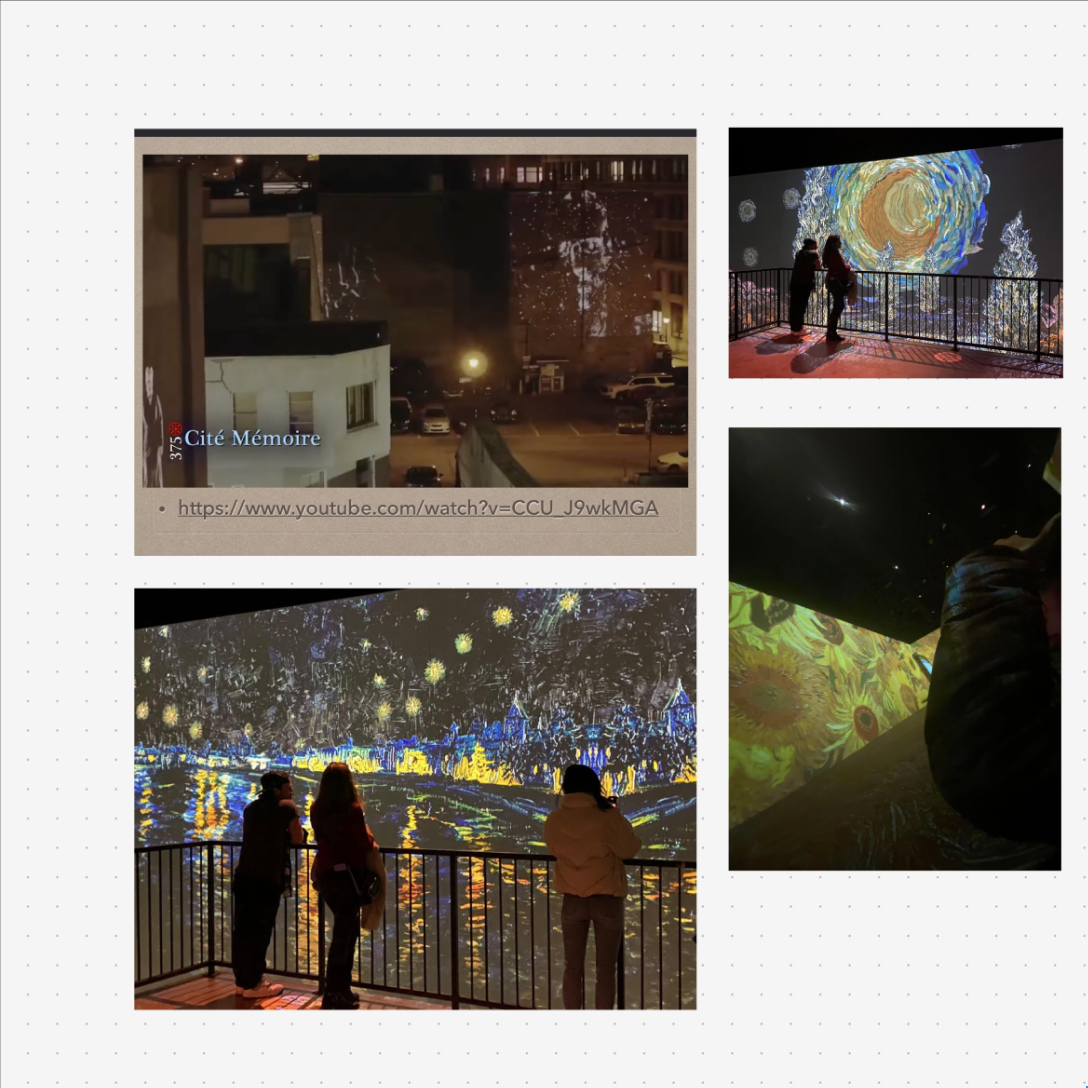
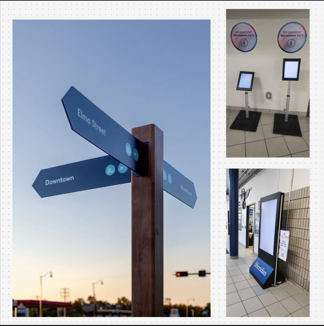
For design challenge 2 I chose this space on the trafalgar campus to redesign in the three different pathways; wayfinding, projection mapping and laser cutting. On a stickey note I rewrote the process (double diamond method) I took to anaylze the area so I could come up with ideas. During the first step of the double diamond method I wrote down every possible issue I could find, that would make this area uncomfortable/problematic.  During the second and third step of the double diamond method I worked on grouping common issues I found into their own categories. After that, i wrote down ideas that met each category. I then moved on to writing possible constraints that could affect how I redesigned this space, and solutions (using the scampter method) to these constraints. Taking into account all my previous ideas, constraints, solutions to my constraints, I wrote down any possible ideas I could add using the different project pathways to this space to make it more inviting and interesting. More possible ideas I could add using the different project pathways to this space to make it more inviting and interesting I then worked on converging onto 3 different ideas. One design for each project pathway. As i moved onto the design challenge I went around campus to take more documentation of the space i chose to redesign. As i moved onto the design challenge I went around campus to take more documentation of the space i chose to redesign. As i moved onto the design challenge I went around campus to take more documentation of the space i chose to redesign. As i moved onto the design challenge I went around campus to take more documentation of the space i chose to redesign. I also went around campus taking pictures of visuals, wayfinding devices, displays, and anything else that could help inspire me. I also went around campus taking pictures of visuals, wayfinding devices, displays, and anything else that could help inspire me. This set of pictures feature more wayfinding and projection visuals. A source of inspiration I drew from for the projection mapping pathway was the week 7 lecture on the Cité Mémoire In montreal, which was a large scale projection mapping exhibit in montreal. My other source of inspiration was when i went to the Immersive Van Gogh Exhibit. I heavily enjoyed this exhibit and the story telling and visuals it had.
                 
                <br> https://www.youtube.com/watch?v=CCU_J9wkMGA
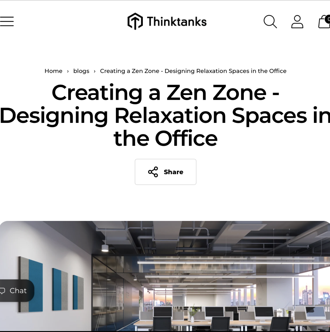
I knew for the redesign of this space I wanted to keep its original use as a hangout/study spot. Thinking back to module 2 spatial data workshop 1, I thought back to the Architectural and evironmental Psychology and their main points of scenery,environment, and humans can affect our behaviours and emotions. I found this website on designing relaxing spaces to improve focus and the importance of having a relaxing space to work. <br> https://thinktanks.io/blogs/futuredesign/creating-a-zen-zone-designing-relaxation-spaces-in-the-office?srsltid=AYCX9vL2t0f5ifKIaLzIcjNIuBSFmglVJPuHKzvfz2Cf8u6zB91oXL9V
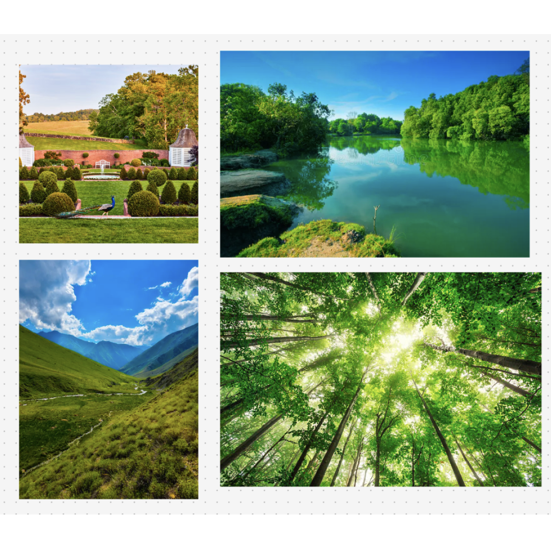
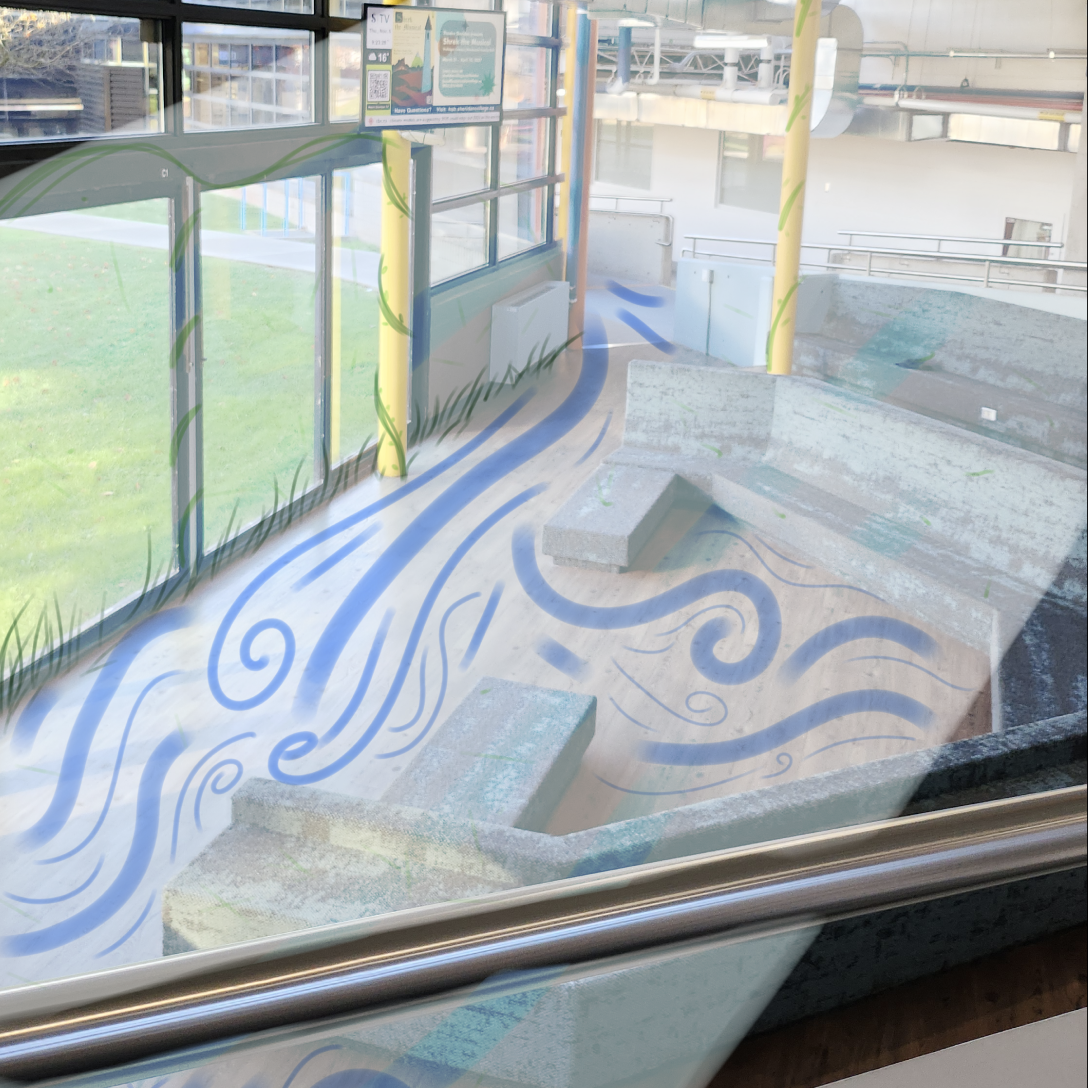
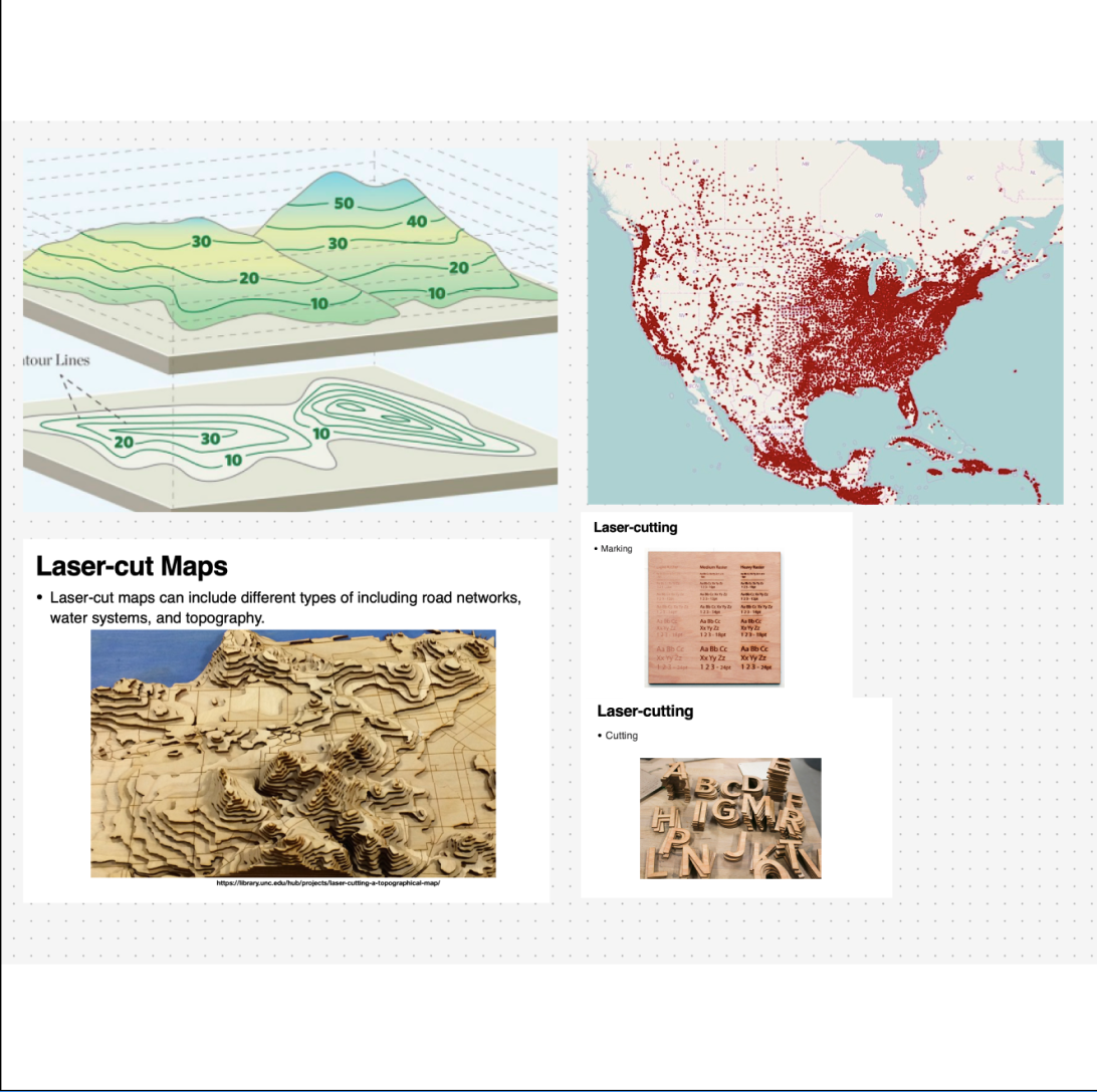
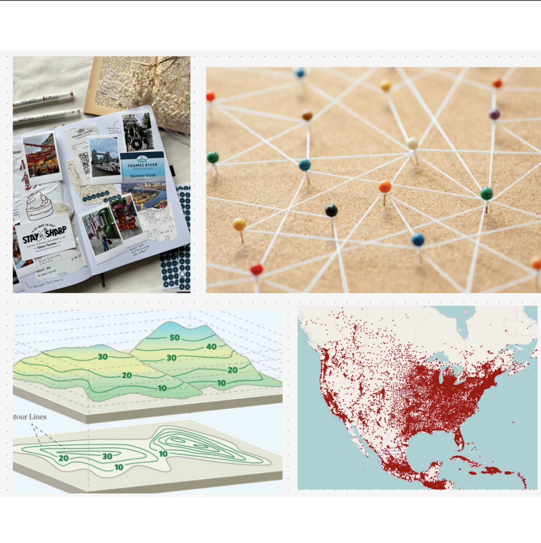
                 My next step was to create a mood board of images i found online. This is my final sketch redesign/concept for the projection mapping pathway. In theory this projection would also we interactive, so students could enjoy the space in another way instead of only having the visuals being projected. My goal was to create an outdoor environment projection that could blend in with the large windows in the space. Connecting the outdoors with the indoor space, immersing the students into a new space. According to environmental psychology, having greenary visuals would decrease stress and increase productivity. My sources of inspiration for the laser cut map pathway were typography and dot density maps. My goal for this design was to visually show were students like to populate the space they're in. After looking at the week 7 slides on laser cutting techniques and materials, I thought for this project the best way to show this would be either cutting out or marking. Possible materials used could be cardboard or wood. <br> https://www.nature.org/en-us/about-us/where-we-work/united-states/washington/stories-in-washington/what-is-topography/ <br> <br>

https://www.visualcapitalist.com/mapping-population-density-dot-town/ I used this website to understand more methodology and different maps used to visualize and document populations. <br> https://www.worldpop.org/focus_areas/population_mapping/  My mood board for this pathway consisted of the two population maps I found, as well as images of scrap booking and a cork board display. Originally in my 
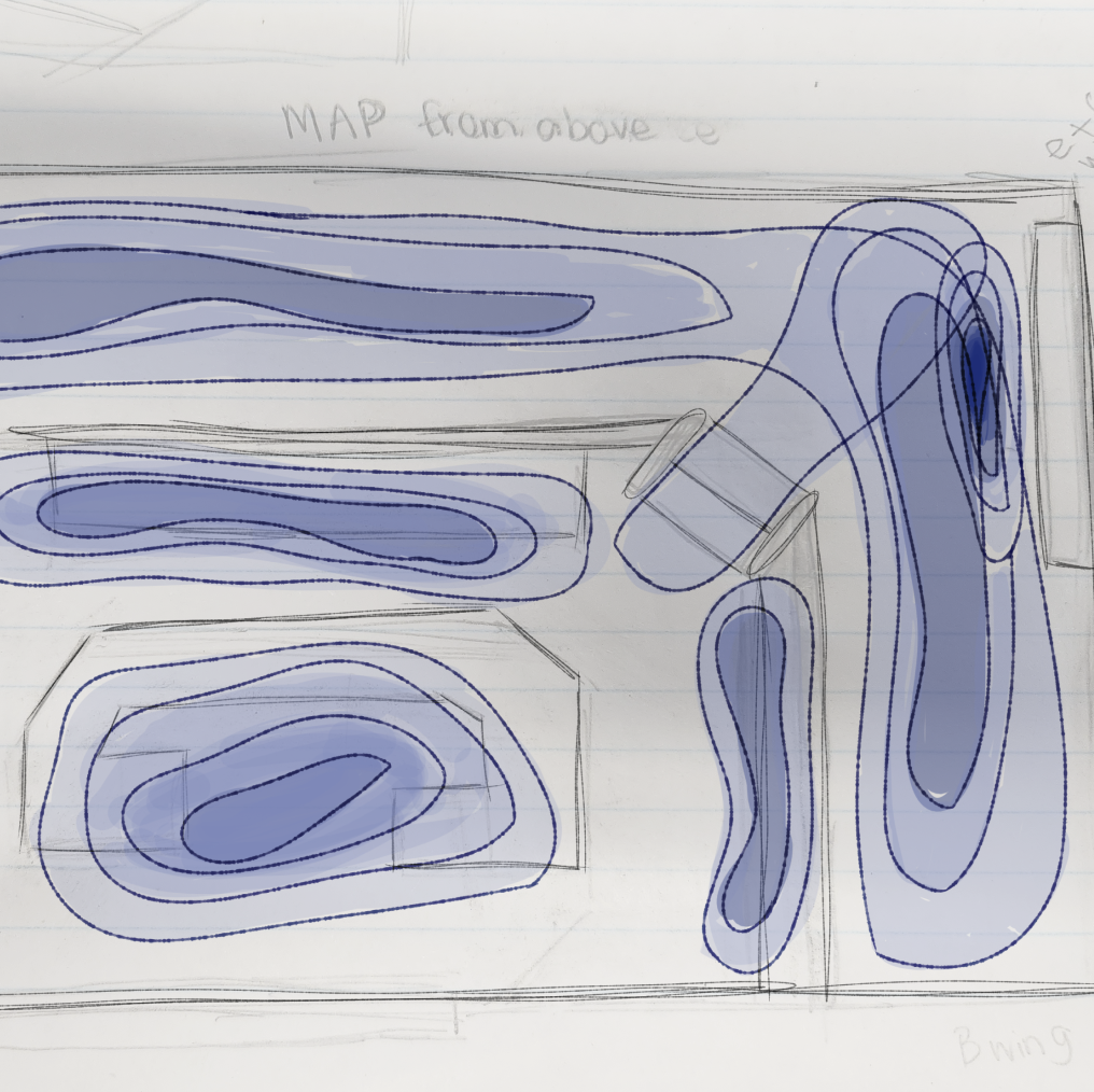
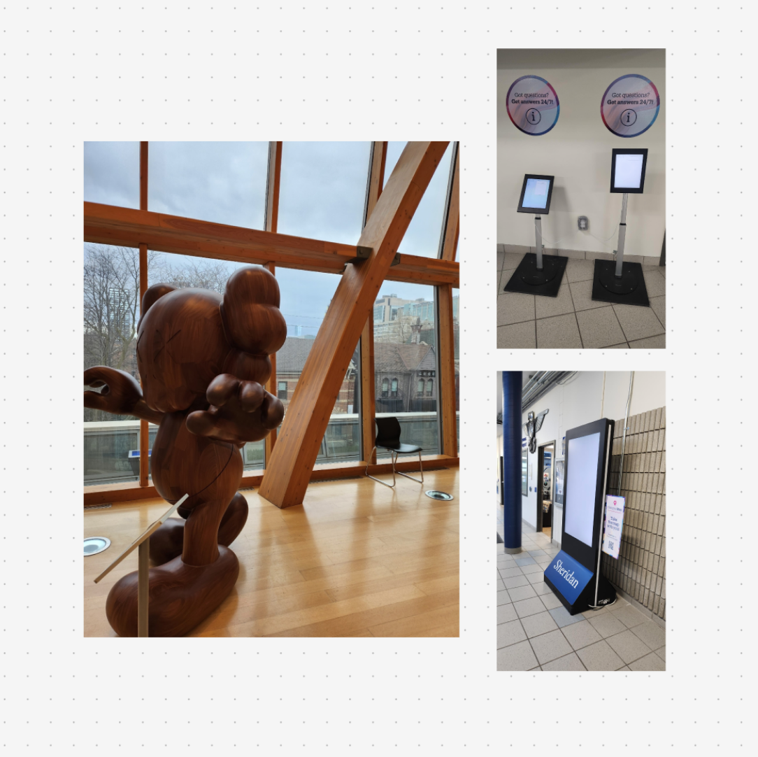
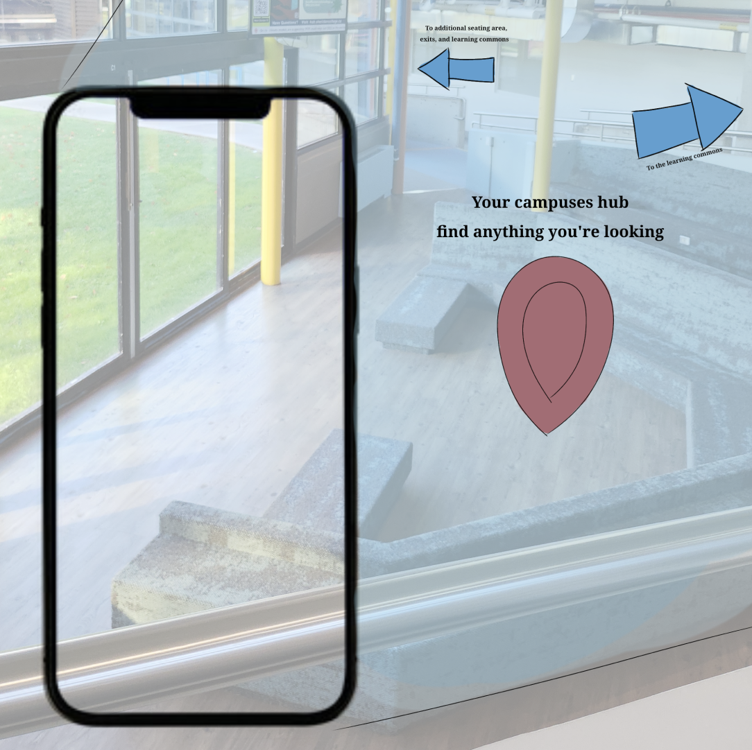
 This is my final sketch design/concept for the laser cutting project pathway. I wanted to combine the concept of the typography map and dot density map, by drawing more rings in the areas students occupy the most. I used lighter and darker colour to signify the hotspots of where students spend more time. The darker the colour meaning where i saw the most students spending their time during my observations.  My inspiration for the wayfinding and AR/VR pathway was my experience at the KAWS exhibit as well as the wayfinding devices on the trafalgar campus. I found that the KAWS AR purpose was completely different to AR wayfinding. Its purpose was for people to place and interact with KAWS sculpters and be able to take photos with sculpters that werent physically there. Compared to wayfinding AR, its purpose is for users to interact and use the AR to find what they're looking for or view more information. For this pathway i decided i wanted to add onto this space a wayfinding hub, so I found this website to learn what colleges specifically guide students using wayfinding. <br> https://screencloud.com/education/wayfinding-college-experience  My mood board for this pathway was modern directional signage, and the wayfinding displays you find on the trafalgar campus. This is my final sketch redesign/concept. The idea for this concept was that using an app, students could point their cameras towards the space (as a possible starting point) to access the campuses wayfinding hub. They would be able to quickly access important sheridan websites, school resources, event updates, as well as use a directonal map. They would also be able to view arrows that point in the direction of other spaces on campus and follow them to go where they need to. This could be used by both potential students, new students, and students who are used to campus life.

Spatial Workshop 1

put a description here or you will lose grades<a href='https://www.youtube.com/embed/tgbNymZ7vqY' target='_blank'><p>Project Video Link</p></a> put a description here or you will lose grades <div class='container'><iframe class='responsive-iframe' src='https://www.youtube.com/embed/tgbNymZ7vqY'></iframe></div> put a description here or you will lose grades

Spatial Workshop 2

put a description here or you will lose grades <a href='https://www.youtube.com/embed/tgbNymZ7vqY' target='_blank'><p>Project Video Link</p></a> put a description here or you will lose grades <div class='container'><iframe class='responsive-iframe' src='https://www.youtube.com/embed/tgbNymZ7vqY'></iframe></div> put a description here or you will lose grades

Project 2


Final Project 2 Design

PLACEHOLDER TEXT, put a description here or you will lose grades

alt
×

Powered by w3.css